I’m going to have a lot more to say about this, but I wanted to jot down some of my first thoughts:
I think it’s beautiful
The lensing of content behind the glass works best when there is motion for the glass to reflect
To me this suggests a big investment in future screenless interfaces where the UI is meant to be in front of “anything”
I’m digging that we are moving to a more monochrome style
The “clear” Home Screen option is incredible in that it proves that the Home Screen can be expressed as light and dark pixels
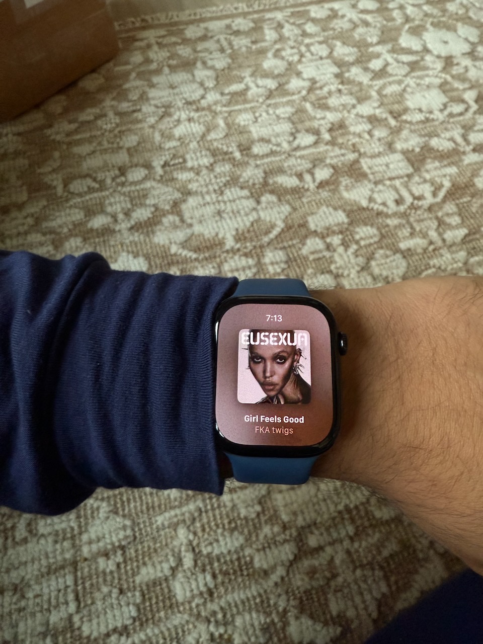
Playing Music on Apple Watch is Super Fun
I've been playing music around the house right out of the speaker on my Apple Watch Series 10. It's really great. I don't remember when this became possible, because it wasn't always, but it's such a nice little way to listen to music hands-free and headphones-free.
Congrats to the Tailwind CSS team on the launch of v4. Between personal and client projects, I've made four or five websites per year the last few years. I truly couldn't have done that without Tailwind, which I use on every one.
This update has some nice improvements: you can now use any number for properties like margin (mt-19 is now possible), there's an updated color palette that's made for P3, and you can configure Tailwind directly in CSS now instead of having to use a JS file.
I made my first website ever on MacRabbit's Espresso back in the day. Would have been great if Tailwind existed back then, let me tell you.
Something New is Coming
Something new is coming to DetailsPro.
Here's one of the teasers for it.
CarPlay Maps: Dual Screen Improvements Needed
There's a simple, gets-under-your-skin issue with CarPlay in cars that can show CarPlay stuff on two screens: you're forced to view turn-by-turn directions on one screen and a route overview on the other.
What do I mean? Take a look:
The screen on the left is what I want to see on both screens. Instead, CarPlay forces you to have one of each.
I'd love to be able to see what's on the left also on the right. Why?
First, because it's great for passengers to be able to see where we're headed. The route overview screen (currently on the right) can sometimes be so zoomed out you don't have any idea what is actually happening. Confusingly, it doesn't communicate your progress through the route because it constantly rescales the map as you drive to keep the route the same visual “size.” In other words, if you've driven five hours of a ten hour road trip, you'd think the route overview screen would show your arrow halfway across the screen, but it doesn't. Instead, it keeps looking like you've just started the trip with your arrow all the way on one side and the destination all the way on the other.
Second, because for some inexplicable reason, Apple Maps doesn't show the next turn-by-turn instruction on the dash map. Take a look at that picture and you'll notice that the screen on the right says "Start on Campus Dr" and the screen on the left doesn't. If you switch your main screen to listen to music or a podcast, you're out of luck! You can't see the next turn-by-turn direction even though CarPlay is aware that Maps is open on the dash screen only.
If you simply try to switch the main screen to be turn-by-turn too, the dash screen changes. And vice-versa. Here's a video showing this behavior in action:
This is just the kind of small, simple, and frustrating issue that you think about every time you drive and get to believing would be an easy fix: if we can't have turn-by-turn directions in the dash then at least let us switch each screen to our own liking.
Now, this doesn't mean I don't think Apple Maps is great, because I do. As an app it has reached almost a platonic ideal of beautiful map styling, reliable directions in the US, and enjoyable features like Share ETA. Where the development of CarPlay's usability has stalled, I can only hope the cause is work being done on
CarPlay 2
.
I've decided to pull the plug on this project and removed the app from the App Store on November 25, 2024. This decision came just a few hours after reading this post by Wil Shipley on Mastodon:
Amazon has shut off the feed that allowed Delicious Library to look up items, unfortunately limiting the app to what users already have (or enter manually).
I wasn’t contacted about this.
I’ve pulled it from the Mac App Store and shut down the website so nobody accidentally buys a non-functional app.
If you're reading this, you probably already know what a truly marvelous app Delicious Library was. Figurative, however, was constantly breaking. I realized it was time to stop—even as a free app, it wasn’t fair to you.
Figurative was an awesome iPad app that, in a way that I've never shared, played a big role in what led me to make DetailsPro.
It was the summer of 2020, I had just left Apple in May, and my tip-top plan was to make Sketch for iPad. That was it—all I wanted to build was an iPad app that could read and write Sketch files. I loved Sketch and wanted to extend it to my favorite device. I actually started on that plan and had a TestFlight out under the name Layer Outer. Ultimately, the beta was short-lived. Why? Because soon after I would discover Figurative.
That was when I realized just how much Figma was eating Sketch's lunch. Right before my eyes was a simple, even flawed wrapper for Figma that was already miles ahead of what my Sketch for iPad could have ever been. Who needed Sketch for iPad when I already had a mostly-working Figma for iPad (and Magic Keyboard)?
So I abandoned Layer Outer. I was already having too much fun in Figurative and it wasn't even Figma's version of iPad Figma.
After some time, I started to itch for wanting to put together SwiftUI views while I was away from my Mac and that's when I started working on DetailsPro.
Cheers to you Matías, for taking the awesome work of everyone at Figma and making it even more fun to use.
That was 2020. I'd be remiss if I didn't mention that I've had similar feelings in 2024, this time while using Figma's Auto Layout features and their new UI3, which are awesome.
I too often ponder when the natural end of the road will be for DetailsPro. In 2020, most were new to SwiftUI and hadn't tried it yet, so a tool that gave them an easy way to noodle around was welcomed. In 2024, I have many more requests for a design tool that can do everything Xcode can, which is not something that is possible to build, so I often feel I'm letting people down.
Plus, as Figma gets better with Auto Layout and official Apple UI Kits, maybe the draw of designing directly in SwiftUI lessens.
Much in the way Matías bumped up against limitations, I too run into things that can't be done simply due to the nature of SwiftUI. Things like how I can't let someone design in native iOS-style SwiftUI without the DetailsPro app running in Catalyst. Xcode can launch iOS simulators to get iOS proportions, but as a third-party developer, I have no such ability without leaning on Catalyst, which naturally means designing in native Mac proportions then goes out the window as a compromise. And we all know Catalyst isn't going to be around forever, so what I am to do? One day, suddenly the DetailsPro app on Mac switches to displaying everything with Mac-based magical UI values instead of the iOS ones that have been available to my users all this time?
It's not today that I feel the end is here, but it doesn't feel that far off. And much in the same way as Matías and Figurative, I know people will have had a blast using DetailsPro, but when do you know if the tool and the environment just don't jive anymore like they used to?
And, because time has a sense of humor: at the end of 2024, Sketch announced they are starting work on their own version of Auto Layout.
Syntax Highlighting SwiftUI Code with Swift Syntax
I recently updated
DetailsPro
to include syntax highlighting in the "Copy Code" section. This was a long-standing request I've had since I first released DetailsPro, which I kept putting off because I thought it was going to be too complex to implement.
Turns out... it's not! So I thought I'd write up a post about how I used
@swiftlang/swift-syntax
to natively parse and syntax-highlight the SwiftUI code that DetailsPro generates.
Designers and developers use DetailsPro to create simple designs like the one seen here and often export or copy code straight into Xcode.
Users create SwiftUI designs in DetailsPro by arranging and styling SwiftUI views to their liking. At any point, they can copy the SwiftUI code that represents their design. My end goal was to display this code in DetailsPro with the same light and dark color schemes as Xcode. Ideally, I wanted a solution that was native Swift, reliable, and worked instantly. It also has to work on iOS, macOS, and visionOS where the DetailsPro editor runs.
Enter: swift-syntax.
HOW SWIFT-SYNTAX WORKS
The good news is that swift-syntax is quite powerful. The bad news is (also) that swift-syntax is quite powerful. At a high level, this library is able to take Swift code you give it and turn it into an abstract representation that can be traversed and manipulated.
So, we can use it for syntax highlighting by using just two of its many abilities: parsing and traversal.
Swift-syntax will take valid code you give it and very quickly identify what is basically a super-nested tree of where things are. For example, something simple like "import SwiftUI" is identified as an ImportDecl, an strongly-typed identifier built-in to swift-syntax, and then within that strongly typed ImportDecl, you can access the part that says "import" and the part that says "SwiftUI". You can see the text contents, the range numbers, and more.
Just this VStack init has many key ranges that are identified and broken down.
There's a great resource made by Kishikawa Katsumi at
swift-ast-explorer.com
that lets you visualize what is happening. I definitely recommend pasting in your code and using this to understand how swift-syntax identifies any particular range of a given input.
Even with just a short and simple file, you get a long abstract tree representation to look at.
HOW I CUSTOMIZED SWIFT-SYNTAX FOR DETAILSPRO
Swift-syntax lets you create your own "SyntaxVisitor" you can use to go through parsed code and do something whenever you're at some part of code that you care about. For example, you can stop whenever you're at a string, a function, a colon, and other landmarks in Swift code that are nodes in the tree. Every Syntax node has properties you can access like text content, child nodes, and most important to us, the range of this node in the original code string.
To start, I needed a function that would take a string of code as input and output a string with attributes that I could directly display in my UI.
For my use case, I created a SyntaxVisitor that would stop at the kinds of nodes that I cared about. In my case, it was only the types of nodes that appear in simple SwiftUI view declarations. Then, as my visitor encountered one of these nodes, I used the range to add an attribute to my AttributedString.
importSwiftParserimportSwiftSyntaximportSwiftUIimportUIKitstructSwiftParser{staticfuncmakeHighlighted(for code:String)->NSAttributedString{let attributedString =NSMutableAttributedString(string: code)let sourceFile =Parser.parse(source: attributedString.string)let visitor =MyVisitor(attributedString: attributedString)
visitor.walk(sourceFile)return attributedString
}}classMyVisitor:SyntaxVisitor{let attributedString:NSMutableAttributedStringinit(attributedString:NSMutableAttributedString){self.attributedString = attributedString
super.init(viewMode:.all)}// Override for the types of nodes you care aboutoverridefuncvisit(_ node:LabeledExprSyntax)->SyntaxVisitorContinueKind{iflet trailingComma = node.trailingComma {highlight(syntax: trailingComma, color:.label)}iflet colon = node.colon {highlight(syntax: colon, color:.label)}iflet label = node.label {highlight(syntax: label, color:.codeOtherTypes)}return.visitChildren
}// Override this general function for visiting common smaller pieces of codeoverridefuncvisit(_ token:TokenSyntax)->SyntaxVisitorContinueKind{if token.leadingTrivia.contains(where:\.isWhitespace){highlight(
startPosition: token.position,
endPosition: token.positionAfterSkippingLeadingTrivia,
color:.gray)}if token.trailingTrivia.contains(where:\.isWhitespace){highlight(
startPosition: token.endPositionBeforeTrailingTrivia,
endPosition: token.endPosition, color:.gray)}switch token.tokenKind {case.binaryOperator(_):highlight(syntax: token, color:.label)case.stringQuote:highlight(syntax: token, color:.codeString)case.stringSegment(_):highlight(syntax: token, color:.codeString)case.integerLiteral(_),.floatLiteral(_):highlight(syntax: token, color:.codeNumbers)case.leftParen,.rightParen,.period:highlight(syntax: token, color:.label)case.leftBrace,.rightBrace,.leftSquare,.rightSquare:highlight(syntax: token, color:.label)default:break}return.skipChildren
}// I created multiple highlight functions to act as convenience methodsprivatefunchighlight(syntax:SyntaxProtocol, color:UIColor){highlight(
startPosition: syntax.positionAfterSkippingLeadingTrivia,
endPosition: syntax.endPositionBeforeTrailingTrivia,
color: color)}privatefunchighlight(
startPosition:AbsolutePosition, endPosition:AbsolutePosition,
color:UIColor){let code = attributedString.string
let tokenStart = code.utf8.index(
code.utf8.startIndex, offsetBy: startPosition.utf8Offset)let tokenEnd = code.utf8.index(
code.utf8.startIndex, offsetBy: endPosition.utf8Offset)let tokenRange:Range<String.Index>= tokenStart..<tokenEnd
let nsRange =NSRange(tokenRange,in: code)highlight(color: color, range: nsRange)}// This is the main highlight method that does the highlightingprivatefunchighlight(color:UIColor, range:NSRange){let font =UIFont.monospacedSystemFont(ofSize:12, weight:.regular)let paragraphStyle =NSMutableParagraphStyle()
paragraphStyle.lineSpacing =6
paragraphStyle.lineBreakMode =.byCharWrapping
attributedString.addAttributes([.font: font,.foregroundColor: color,.paragraphStyle: paragraphStyle,], range: range)}}
Tips I Wish I Knew
First, you'll encounter a concept called "trivia" which is the name swift-syntax gives whitespaces, newlines, tabs, and comments. It took me a while to figure out that through trivia is how you can highlight something like a line comment. And, I needed to make sure I was formatting the invisible whitespace between nodes so that my code still displayed proper spacing.
Second, the SyntaxVisitor functions expect a return value like the .skipChildren or .visitChildren values you see above. It took me a while to figure out exactly what was going on here, and basically what you're doing is telling the visitor whether or not it needs to go deeper after whatever you've identified. For example, if you've already identified an "import SwiftUI" statement and highlighted the appropriate parts, there's likely nothing more in there. With other higher-level nodes you'll visit, you'll likely want to keep visiting any nested child nodes that may exist.
The End Results
DetailsPro now shows live-updating, syntax-highlighted SwiftUI code when users select any part of their design.
Today, syntax highlighting is running great in DetailsPro and I'm happy to have added a what is surely a reliable dependency that will enjoy continued support by the Swift community.
I was on Tim Chaten's wonderful podcast this past week. We chatted about the visionOS version of DetailsPro and what went into making it. Thanks again, Tim, for having me on.
Things I'm Excited for on Apple Vision Pro
Watching a movie with AirPods Max on from bed
Opening up emails in a huge mail window in my living room
Catching an NBA game courtside (surely, this will be offered)
Enjoying focusing on some work in the immersive Environments
Making DetailsPro work well to design visionOS apps quickly
Frustration Using Apple News+
Apple News+ magazines on a 12.9-inch iPad Pro should look and feel amazing, but sadly that’s not the case today. In this post I’ll show what is frustrating about the experience and how things could be improved.
Magazine Covers
Here's a current A-list magazine and my iPad side-by-side. We can see they're similar enough in size:
Vogue December 2023 on the left, my 12.9-inch iPad Pro on the right.
Now here’s what it looks like when you open this magazine on the iPad:
The cover is cut off on the iPad.
The frustration begins and the reading experience is interrupted as soon as you notice you’re not able to see the whole cover without scrolling.
The cover photo is not fully shown and lines of text are unreadable.
The frustration continues a few seconds after starting to read the cover: it’s not sharp and in Retina-resolution, but blurry and noticeably pixelated. You’d be forgiven for thinking we're waiting for a progressive JPEG to load, but this is it.
A screenshot from my iPad at Actual Size in Preview. Go ahead and check out the image up close to see for yourself.
This is strange to me. How could this be? What part of the pipeline could be limiting the magazine covers from looking sharp?
The Fix
The covers should be sharp, Retina-resolution images. They would be a lot more fun to view too if they were "fit" instead of "filled" on the screen. Here's a quick mockup of how that could look:
It would be great to be able to see the whole cover without scrolling, no matter how the iPad and magazine ratios differ.
Tables of Contents
Here's the table of contents from that same issue of Vogue:
It's not that creative, but we do get a big photo from one of the big features and teaser summaries for the smaller stories.
Now here's what it looks like when you open the table of contents on the iPad:
The text-only treatment makes the table of contents not only drab but exhausting to use.
Again the reading experience is hindered by this design decision to make exploring magazines devoid of any of the visual richness of, well, magazines.
On a print magazine, you can flip through with your fingers and get a quick sense of the photographs within. On the iPad, you have to tap in and out of the table of contents going only off of these text titles that all look the same.
The Fix
The table of contents should be visually rich and hint at the photographs within. There could be interactivity here too, perhaps allowing you to preview a story without opening it, see estimated reading times, or save a story for later directly from the table of contents.
Here's a quick mockup of how it could look simply to add thumbnails to the existing design with no other changes:
Simple thumbnails of lead images would go a long way.
Thanks for Reading
I love Apple, I love magazines, I love the HI design teams at Apple... I love all of it. That's why I'm writing this post. All I want is for these things to be improved.
I admire the people who worked on this to get it this far. I know it must be difficult to be innovating in the magazine industry, where there have been nothing but headwinds for who knows how long. It's amazing to have this breadth of choice, rolled into Apple One, at my fingertips.
But, that doesn't mean that what this app offers today isn't frustrating. I'm someone who wants to use Apple News+, who wants to tell my friends about it, share stories, and keep paying for it for the foreseeable future. And yet, I can't because many small frustrations add up to an experience that I don't look forward to repeating.
I'll be waiting patiently for that silent update someday when Apple News+ suddenly gets a whole lot better, and rooting for them all the way.